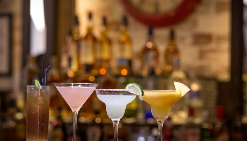
Colour as language: two liqueurs leaning into visual impact
There is a moment when a liqueur starts to say something before it is tasted: the instant it enters the visual field. The colour of the liquid, the way it catches the light, and its presence on a shelf or in a glass can shape how it is read from the very first glance. In a few recent cases, that visual layer has become an explicit part of the product’s positioning.
This is not a category-wide reset, nor evidence that the whole liqueur segment is changing direction at once. It is, rather, a useful way to look at how certain brands are using colour to become easier to recognise, simpler to place and more in tune with the occasion in which the drink is served or shared.
The liquid as a marker
De Kuyper Royal Distillers, the Dutch company known for its long-standing work in liqueurs, has recently repositioned Peachtree with a liquid closer to peach in colour, presenting it as more recognisable in the glass. The idea is not to alter the product’s identity, but to make the link between what is seen and the aromatic idea behind the brand feel more immediate.
On the surface it looks like a small adjustment. In practice, it is a meaningful one. In a category where many products share similar formats, silhouettes and visual codes, the colour of the liquid can become a simple but effective signal. It does not rely on a label explanation, and it does not depend entirely on the bottle design. It works at the moment of service, when the drink reaches the table, the counter or a shared photo.
A related approach, although with a more overtly social and evening-led register, can be seen in Neon Spirits Sunset Orange, an aperitif launched by Tastillery, a German online retailer. Built on a rosé-wine base with citrus and botanical notes, the drink appears designed with visual impact in mind, and with the kind of glass appeal that helps it stand out in convivial settings. Here too, colour is not just decoration: it is part of the drink’s identity and of how it is meant to be perceived.
Why the idea resonates now
These examples gain context when set alongside the attention paid today to visual experience in bars and shared drinking occasions. The inaugural Europe’s 50 Best Bars, voted on by a panel of 300 industry experts across Europe, placed Line in Athens at No. 1, with other European cities also well represented near the top. The list reflects a bar scene that remains lively and strongly focused on experience as much as technique.
Line, the Athens bar known for its interest in fermentation and ingredients, is a good reminder that a drink is often read as an object with a story before it is approached as a simple serve. In that setting, the colour of a liqueur does not work in isolation, but as part of a broader language of service, presentation and instant perception. For brands, that means speaking to an environment where the eye often arrives before the palate.
Still, one point matters more than the visual effect itself: colour may help a product get noticed, but it does not replace what matters over time. Loyalty to a liqueur still depends on product quality, flavour consistency and the ability to deliver on its promise. If the visual layer opens the door, the liquid inside decides whether anyone comes back. That may be the clearest way to read this renewed interest in colour: not as ornament, but as the first layer of a strategy that still has to hold up once the glass is empty.